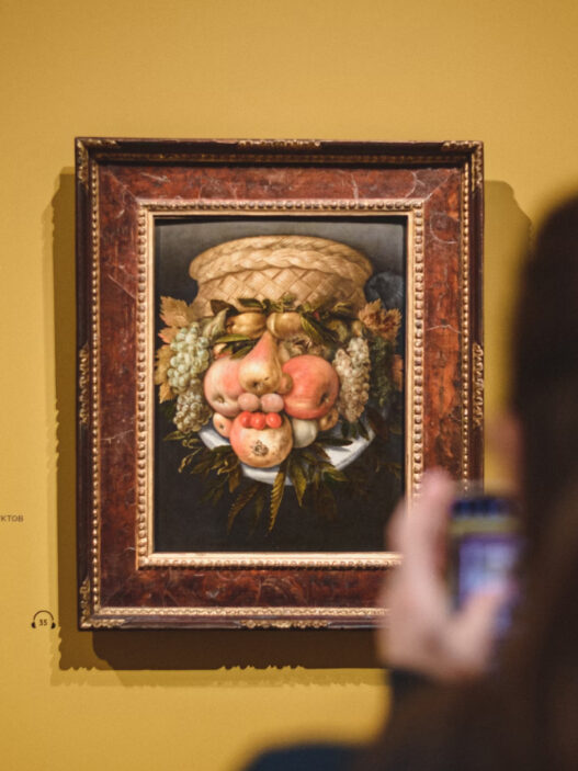


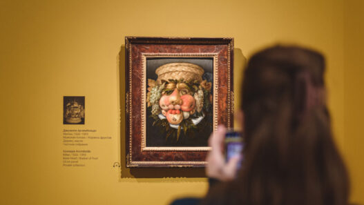

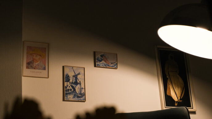

I keep returning to a small portrait above a desk. A woman sits in profile, her hands folded. In morning light the skin is alive with rose and olive. At night the ceiling bulb turns her cool, like a memory that has been refrigerated. The painting did not change. The light changed, and the truth traveled with it.
Most of us trust our eyes. Our eyes are loyal, but they are also diplomatic. They work hard to make the world look normal in bad light. This is called color constancy: the brain edits what you see to keep the scene believable. You can walk from sunlight to a fluorescent hallway and still recognize a red sweater as red. That trick is useful in life. It is disastrous for art.
Art asks us to notice what is really there. Lighting decides how much of that reality survives.
Why bad light lies
- Color temperature (CCT) shifts mood. Warm light around 2700 to 3000 K reads intimate. Cool light at 4000 K and above feels clinical. If you light a Matisse with cold light, joy becomes chalk.
- Color Rendering Index (CRI) predicts how faithfully colors appear. A CRI of 90 or higher is the ticket. Below that, greens dull and reds sulk.
- Lux is brightness at the surface. Too little and blacks collapse to mush. Too much and whites scorch to glare. Paintings at home often live between 150 and 300 lux. Photographs and works on paper prefer less.
- Angle controls reflections. A 30 degree aim from the vertical reduces glare on glossy varnish. Front-on light flattens everything like a passport booth.
- Spectrum matters beyond the single number. Two bulbs can both say 3000 K and still push different reds. This is metamerism: different spectra producing the same apparent color under some conditions. The fix is better spectra, not louder marketing.
A short experiment you can do tonight
Stand before your chosen piece with two bulbs in hand:
- a 2700 K LED rated 90+ CRI, and
- a 3500 K LED rated 95+ CRI.
Swap them. Watch the background first. Then the midtones. Then the edge between light and shadow. If the painting is a person, pay attention to the mouth. You will discover not only which light is kinder. You will discover which light keeps a secret and which light tells it.
The quick rules that save most rooms
For homes
- Pick high-CRI LEDs: 90+ CRI as a baseline, 95+ if portraits or skin tones dominate.
- Choose CCT on purpose: 2700 to 3000 K for warm rooms and wood; 3000 to 3500 K for contemporary spaces and bright walls.
- Set the ratio: art should be brighter than the wall around it by a factor of about 3 to 1.
- Aim at 30 degrees: measure from the vertical down to the beam. This reduces glare and softens texture nicely.
- Diffuse when close: add a lens or use a wall wash if the fixture sits within one meter of the art.
- Dim for paper: works on paper and textiles are light sensitive. Keep them lower in lux and use a dimmer.
- Kill spill: snoots and louvers keep light off frames and away from your eyes.
- Mind heat and UV: quality LEDs run cool at the beam and have minimal UV. Avoid halogen on sensitive works.
For galleries and schools
- Consistency beats drama: keep a unified CCT across the room so viewers do not keep adapting.
- Light the label: people move closer to read. Give the caption enough light to avoid phone-flash moments.
- Control reflections: for glossy works, two softer beams at opposing angles work better than one hard beam.
- Test with a gray card: hold a neutral gray beside the piece when focusing lights. If the gray skews pink or green, fix the source.
- Measure, then trust your eye: a simple lux app on a phone is imperfect but better than guessing.
Matching light to art
- Oil on canvas: 3000 K, CRI 95+, 150 to 300 lux. Add cross-light if impasto texture is important.
- Acrylic on panel: 3000 to 3500 K, CRI 90+, 150 to 250 lux. Acrylic can look plasticky under cold light.
- Black and white photographs: 3000 K, CRI 95+, 50 to 150 lux. Cooler light can push paper to blue.
- Watercolors and works on paper: 2700 to 3000 K, CRI 95+, 50 to 100 lux. Keep the exposure short when possible.
- Sculpture in stone or wood: 3000 K, CRI 90+, side lighting to reveal form, a gentle fill to keep shadows legible.
How privilege sneaks in
There is a politics to all this. Museums with good budgets buy perfect spectra and measure every lumen. Smaller institutions inherit a ceiling grid and a set of amber LEDs from a renovation four directors ago. Domestic interiors are even more varied. A single bad bulb in a rented room can turn a vivid memory into a cardboard cutout. When we speak about access to art, we should include access to decent light.
The story of a portrait and a kitchen bulb
A friend brought home a portrait of her mother. In the gallery, the background held a quiet blue. At home it went gray. She thought she had made a mistake. The painting looked tired, as if it had traveled too far. We unscrewed the kitchen bulb, the one that made the counter look like a hospital tray. We tried a warmer lamp, high CRI, a narrow beam. The blue returned. The mother returned. It felt like opening a window.
Troubleshooting in one minute
- Looks flat: increase the angle from 20 to 30 degrees, add a second light at lower intensity.
- Colors feel off: replace the lamp with 95+ CRI or try a slightly warmer CCT.
- Hotspot on varnish: move the light to the side and narrow the beam.
- Shadows too harsh: add diffusion or bounce off a wall.
- Viewer squints: cut glare with louvers and lower the ambient light, not the art light.
The ethic of fidelity
Artists choose pigments for a reason. Curators place works in sequence for a reason. Lighting is part of the translation that brings those choices into your room. It should be quiet, exact, and kind. The point is not to make the art prettier. The point is to let the work be itself.
Before you change it, see it. Before you judge it, light it.